How we reimagined search for the Guardian app in one day

Read on The Guardian’s Engineering Blog
There are two key reasons we believe our readers rely on the ability to search. Firstly for expedience: they read an article or know they like a particular contributor and want to quickly get there again. Secondly is out of exhaustion. After trying to find something manually by combing through the menu without any luck, they tap on the magnifying glass icon as a last resort. Both are crucial as mobile attention spans are painfully low — especially for the latter situation as the reader is likely to be one failed attempt away from giving up and leaving.
Defining the problem
At the Guardian we prioritise features we believe will be of most value to our readers by making data based decisions. What do the numbers say about where our users are spending their time? What headlines and menu items are being tapped on? etc. But of course that is only half the story. A reader could spend a long time on a page because they cannot figure out the navigation, so what looks like a positive figure in time spent is a negative experience in reality.
From a data perspective, ‘search’ was hard to define as a problem — we felt it wasn’t what readers wanted but the feature had very little tracking on it. What’s more, if readers found it frustrating they were unlikely to use it again, meaning the number of visitors would be low anyway. Fortunately we hear from our readers frequently when they are unhappy with a feature (yes, fortunately) and we heard about search from a small but vocal minority enough to know there was an issue.
What we had to work with
The previous search only returned tags which had no hierarchy. The results from searching “UK” shown here are especially unhelpful.
The previous Guardian search on the mobile app was a “tag” search with the ability to add results to the homepage. Adding tags to the homepage is a nice feature — Guardian articles are tagged with keywords resulting in some 8,000+ total tags. If you are interested in a particularly specialist area — say bullfighting — you can have anything published with that tag added as a container on your homepage. Unfortunately, this version of search does not address either of the key user cases listed above.
The content appeared in alphabetical rather than relevant order, articles were not available at all and every listed item had an ‘add to home’ icon next to it. As mentioned adding to home is a hugely powerful and useful feature, but it wasn’t in the right place here.
Creating solutions — quickly
Sketches of the new search, our ideas included adding articles and visually distinguishing different categories of content.
As there was not a clear data argument for spending a lot of time revising search, we tackled it in one day. This is a new way of working for the apps team, where we quickly define problems, brainstorm solutions, then build the best ideas and test them. Adam Fisher, one of our server-side engineers, was keen we revise search and asked me to team up for some UX guidance.
We sketched out our solutions which I put together in Illustrator and Keynote while he did the hard work of making the backend system work the way we wanted.
A few of the key changes we made:
There are three clear buckets of content — articles, contributors and tags. Previously articles were not available at all.
‘Tags’ was renamed ‘subjects’ (I always think of my grandmother when naming anything audience facing: calling something ‘tags’ would earn an angry finger wagging).
The buckets order based on what search thinks you are looking for. Lots of words mean you are probably after an article. If you search for a main section it tops the list and is bolded to distinguish it from smaller sections.
The ‘add to home’ button is stripped out from the search results. Readers can still add to their homepage, they just have to click through and do it from the front of the section, subject or contributor.
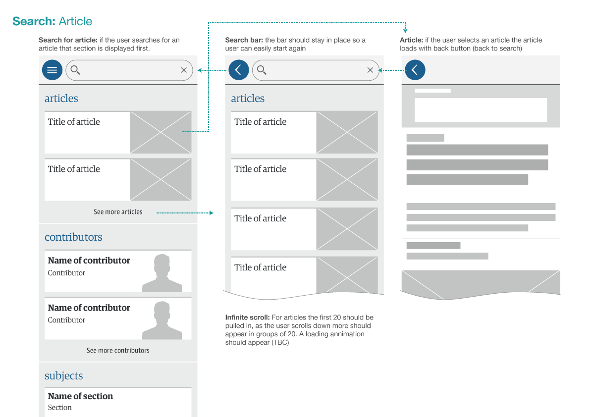
A wireframe of a user journey if they search for an article.
Our revised version felt strong enough to release with added tracking to better understand how people are using search for future improvements.
Polishing and releasing
We brought the idea to life with small portraits of the contributors, easy to identify icons on the articles and a clean typographic hierarchy for the subjects — all designed to make it easier for the user to find what they are looking for.

We designed search to make it easier to visually find what the reader is looking for.
Working closely with the front-end developers we have recently launched the new and improved search feature to Android with release to the iOS app imminent.
Search is not done. We wanted to get this first pass out the door and build upon what we learn from our audience. We’re always updating and improving the app and quickly resolving issues and then iterating to make the experience better and better is how we want to work going forwards.