Designing in the dark: How we created the Guardian App for Apple Watch
Read on The Guardian’s Engineering Blog
Whenever we are creating something for our readers, we start by understanding their needs. Typically that involves digging into usage data to find patterns of behaviour in addition to speaking to people to understand how they are using our product. Last November when we kicked off designs for Apple Watch we had no such luxury. Not only had we never held one, but we could only guess how people would actually use it.
“Research” and idea generation
Although we could not do traditional methods of research, the whole apps team is passionate about mobile technology and quite a few of us have Android wearables, meaning we could pool our collective experiences. We also had the guidelines from Apple explaining that Watch would be lightweight, timely and highly personal.
Kicked off by our product manager Tom Grinsted and Mobile Editor Subhajit Banerjee we got together and discussed everything we knew about the device. Lead iOS developer Petr Krojzl had been working on the WatchKit (the code released from Apple for Watch) in his spare time and explained the key features: App, Glance and Notifications.

Our working wall of how the Apple Watch looked and worked
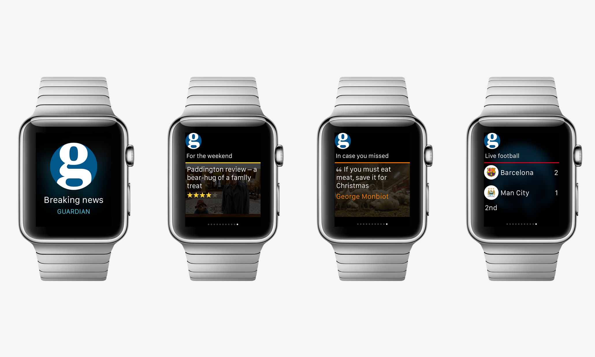
The “App” is the full offering on the device - a mini version of the main app that is on the iPhone. “Glance” is a snapshot of the Watch app, it is meant to be whatever is most relevant at that time. Finally “Notifications” are the easiest to understand, they are alerts that something has happened (a new email for example) and Watch vibrates and pops up a message to tell you about it.
Quite quickly we realised that the experience had to be lightweight and relevant. We knew readers would be looking at the Guardian on Watch for a few seconds, tops. We listed all of the things the app could display, but as a team we honed in on the idea that the app should give the user one key thing that they should know at any given moment.
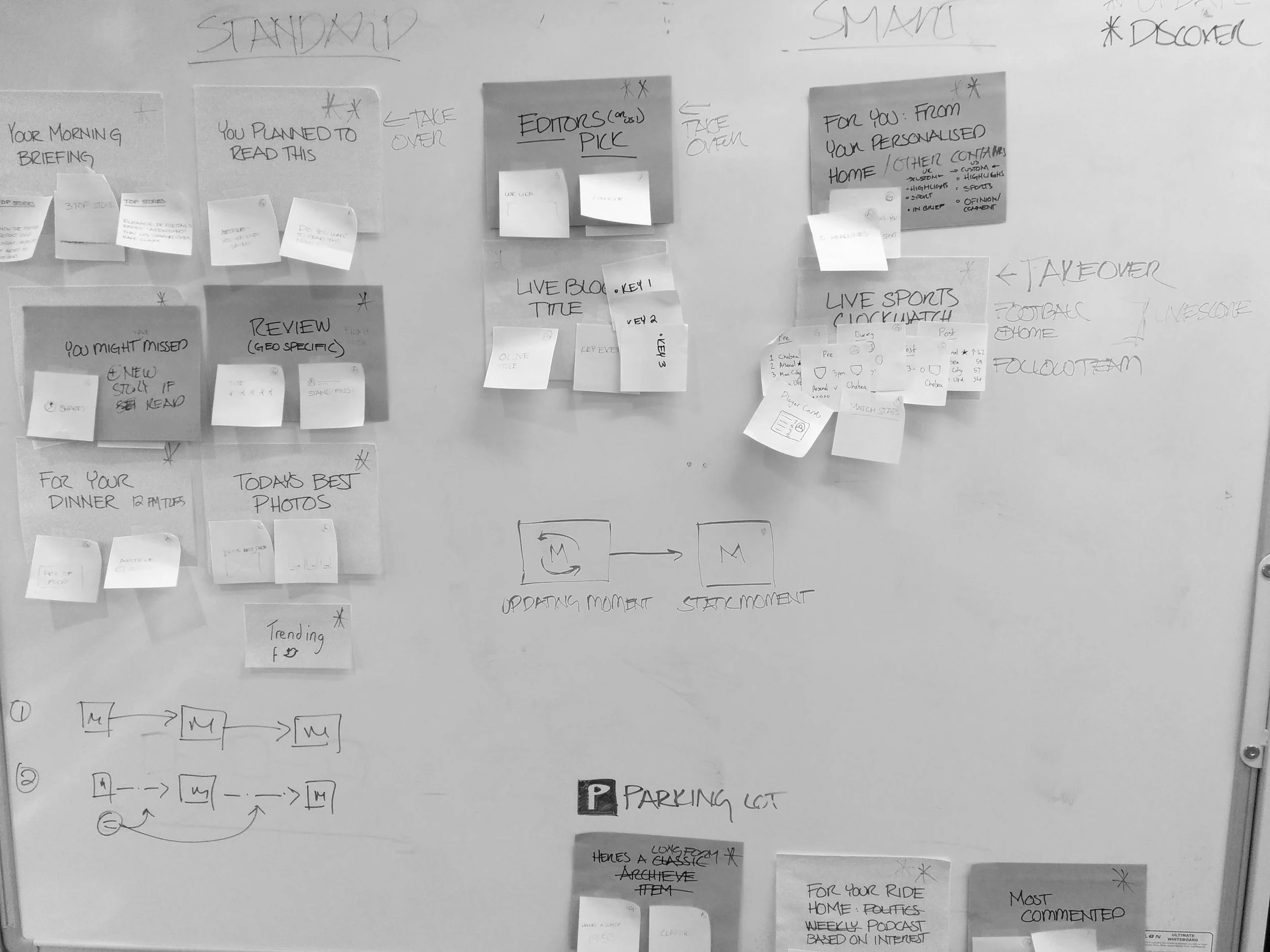
The team sketched out lots of ideas and we voted on our top choices
The team sketched out lots of ideas and we voted on our top choices
Dubbed ‘Moments’ by Creative Director Alex Breuer (with the pun intended), the idea evolved to be a single piece of content for a user at any given time. Rather than always being news headlines however, the content itself would vary over the day depending on context and history to ensure the reader always gets something fresh and worthwhile. This also reflects the Guardian brand, which whilst serious at times is also not afraid to be fun and playful.
To get a feel for the actual size we made an Apple Watch to scale out of paper and held together with blue tack
Mapping the day for Guardian Moments
We know Guardian readers have core needs around getting fast updates, extending their knowledge and discovering new content. Especially first thing in the morning, there is a critical user need to know the very latest of what is going on in the news. Over the course of the day however, there is more interest in light and different stories and we wanted to show off the range of what we produce to help readers discover stories. We picked out our great content, ranging from photo highlights of the day on a Monday as a pick-me-up to Peter Bradshaw’s film of the week on a Friday to get ready for the weekend.
It must have looked a bit odd, but we printed images of Apple Watch to scale and while designing I kept one on my wrist, held in place by blue tack. It forced me to think about the experience on that small screen and how quick the interactions would be (holding your arm up for a long time is tiring). Although there was a lot of complexity behind what the Guardian Watch app was choosing to display, the user experience was designed to be extremely minimal and very relevant. We mapped the whole experience in a timeline.
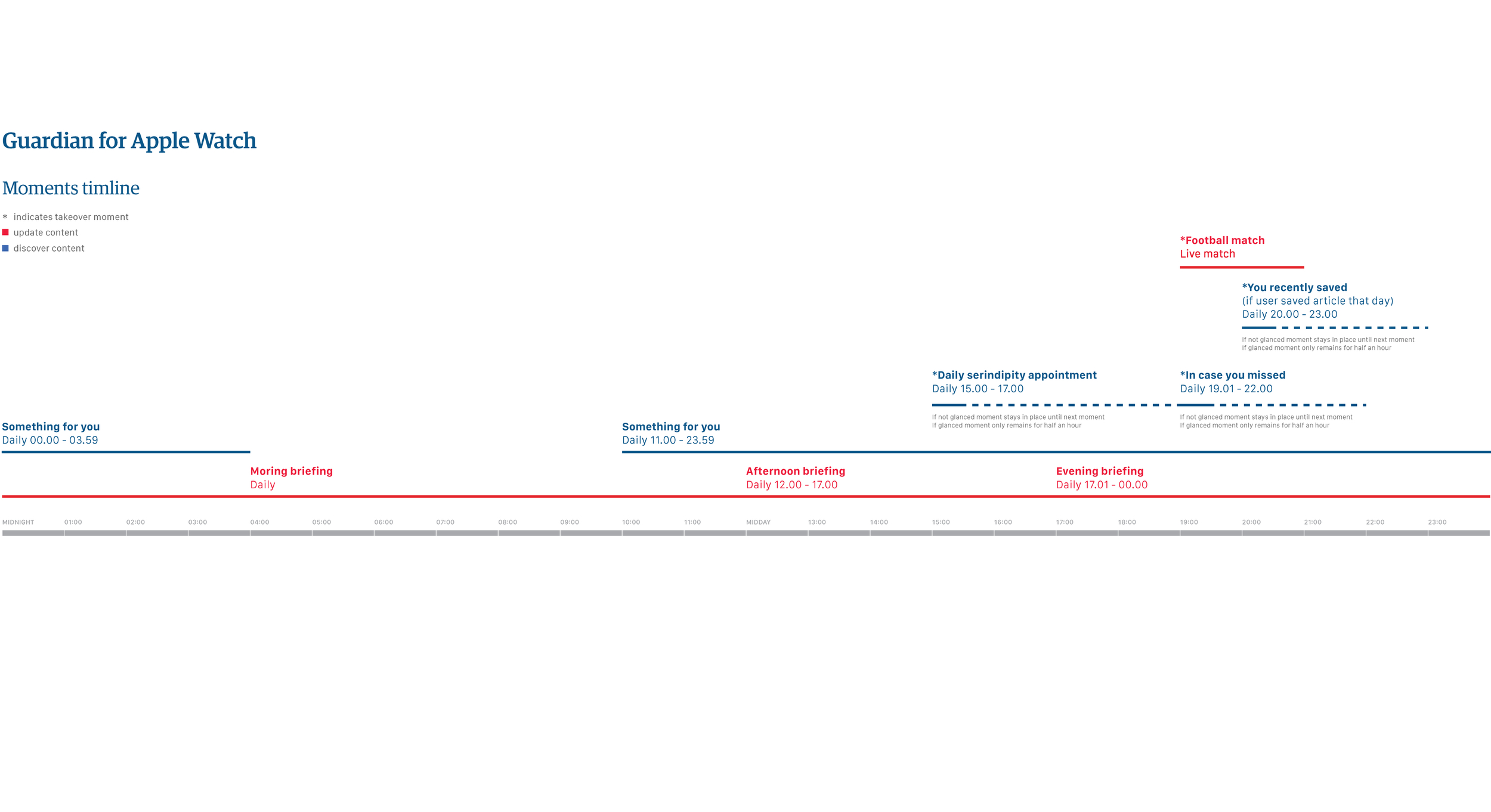
A timeline for what the Guardian Watch app would display
With the exception of the morning briefing - the editorial top stories of the day - once a piece of content has been seen or read, it refreshes itself with something new. Likewise we wanted the content to be personal, so the Watch app pulls in stories that the user hasn’t read from their app homepage, which can be personalised to ensure that if Archaeology is your favourite section then unread Archaeology stories are what you will get.
Finally we knew that football is something a lot of Guardian readers love. We introduced tracking in the app that would count the number of times you read a football story about a particular team. If you hit the threshold, match cards would appear on your Watch whenever your team is playing. This also ensured that people who were not interested in football would not see any of it.
Design and execution
We reworked the Apple Watch templates to give them Guardian style. The morning briefing kept a focused headline update tone, whereas features and movie reviews had a more relaxed feel.
We worked closely with visual design to ensure readers instantly recognise that they’re reading Guardian content, no matter what device they’re on.
Release and next steps
Alongside many other enthusiasts we anxiously awaited the impact of Apple Watch. For our team it was seen as a chance to experiment and try something new.
Designing in the dark was daunting at first, but invigorating by the end. It meant we could not rely on previous products and decisions, but had to genuinely imagine our readers’ lives with this new bit of technology and trust our instincts.