The User Experience of Creative Sprints
Illustration by Sunnu Rebecca Choi
Read on The Guardian’s Engineering Blog
What are Creative Sprints?
Creative sprints are typically multiple day processes that get a whole team together to define the challenge, come up with a lot of ideas, build the best ideas and test them out. Pioneered by Google Ventures for small start-ups, we have modified them for a company of the Guardian’s size.
While this is an intensive process it’s also very effective at getting an entire team focused on solving a problem quickly. There are clear opportunities for stakeholders to have input but it also ensures the entire team feels ownership over what they are working on. Structured diverge (go wide) and converge (narrow down) opportunities mean vocal team members and quiet ones all get a chance to contribute. When done correctly they are also a lot of fun - having coffee and sweets throughout is a must.
We ran sprints on the Guardian Apps team multiple times and the themes ranged from blue sky team strategies to very specific technical issues. One from last year was on how we can make the app a better overall experience and here is how we did it.
Part I: Set the challenge
What is the issue we need to solve?
This step is often skipped because everyone assumes everyone else has the same opinion on what that challenge is, but it’s a crucial part of the process because inevitably people’s opinions vary hugely. Come together as a team with stakeholders to understand exactly what the issue is/issues are and prioritise them. This is about understanding what the problems are, but not about creating solutions.
Before kicking off the Apps team sprint we did an intensive month of research. We ran a diary study with over 20 Guardian readers and met with them one on one to better understand their habits and needs. We boiled the research down into three key behaviours: Guardian Guru, Social Browser and the News Junkie.
Each profile had a distinct behaviour and challenge for the team. For example the Social Browser is reading all of the comments on the Guardian app but is not participating herself. The challenge for the team was to get her involved. We presented all of the research to the team and stakeholders alike.
Each profile had an in depth detail slide plus collection of examples from the research with readers.
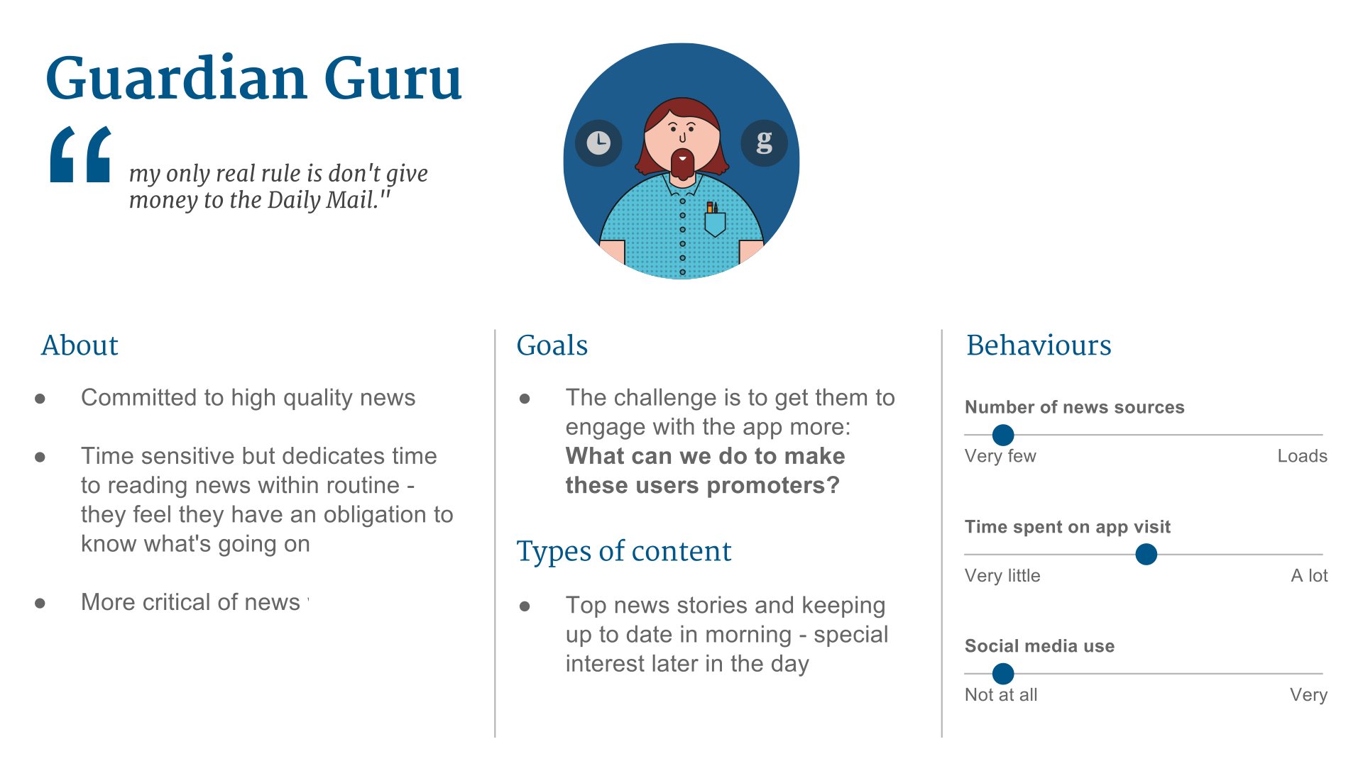
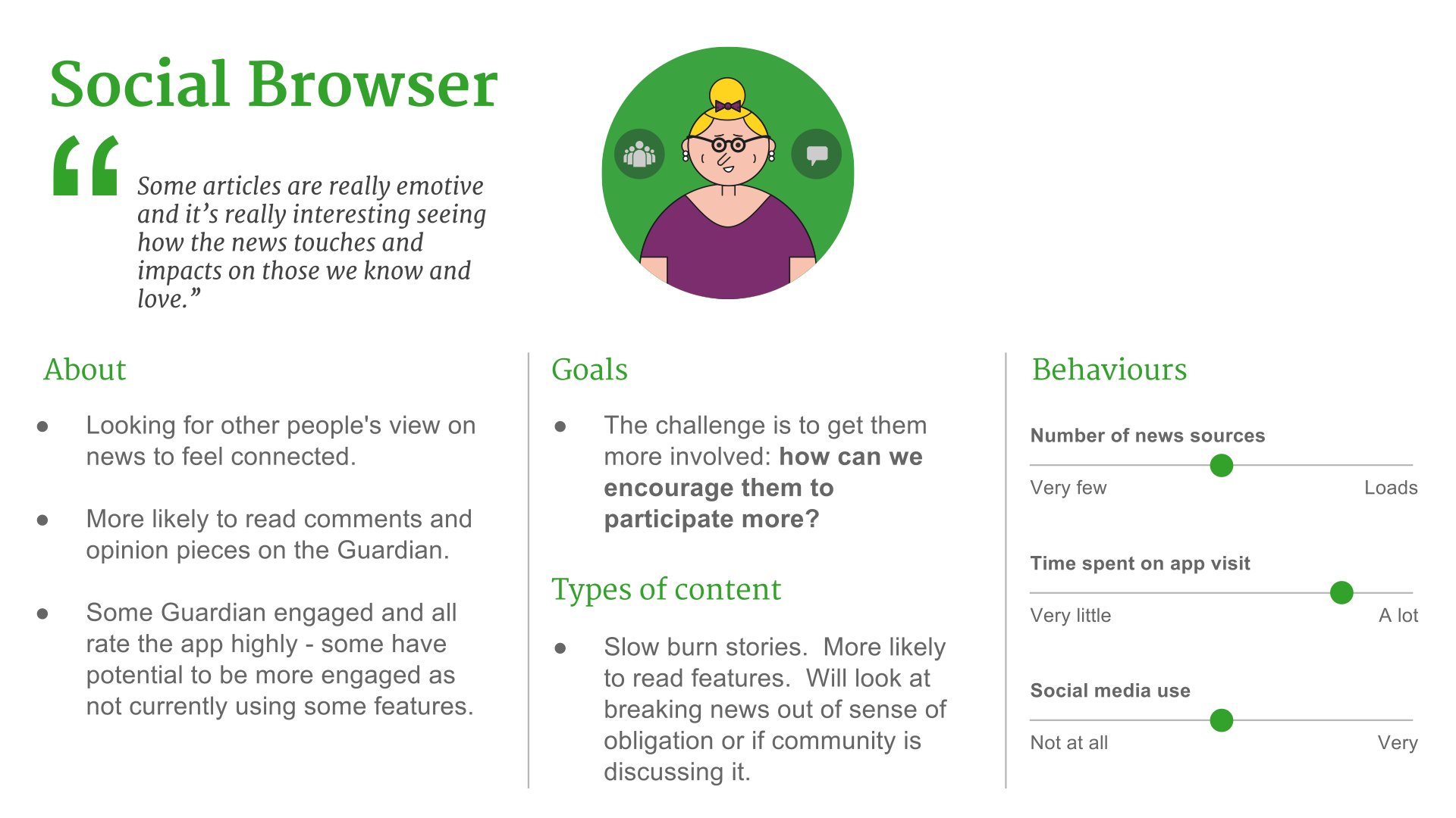
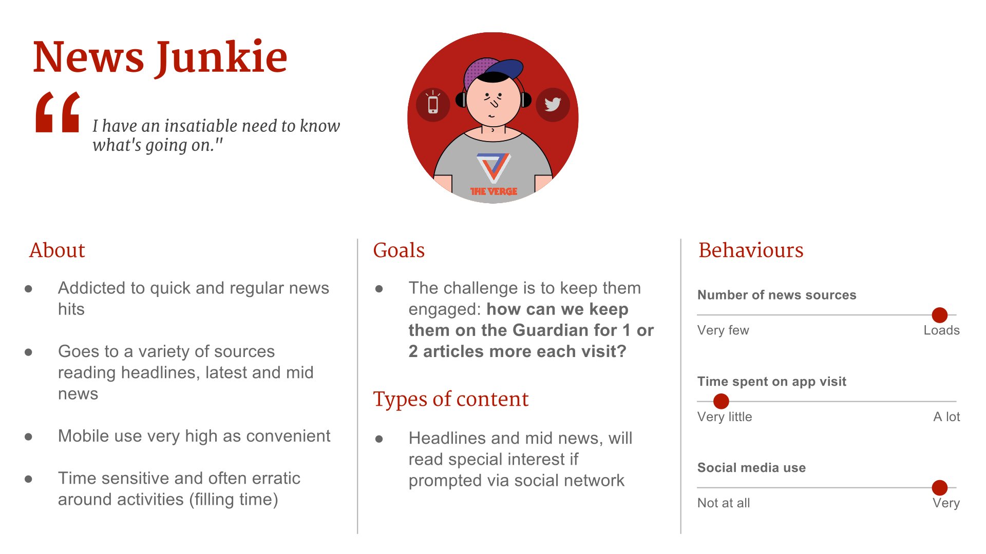
At the end of the session all the team members were assigned a profile and given homework: think long and hard about that reader, then come up with an awful idea for them.
Part II: Brainstorm solutions (a lot of them)
How might we solve the issue?
This step is the opportunity to come up with ideas - a lot of them. Brainstorming can be intimidating for people, there should be a clear structure with prompts that make it easier for people to speak up and keep the energy high. There should be loud time (where the team comes together and all talk) and quiet time (where people work in small teams or individually) throughout. The mood should be animated, if you see the energy dropping consider a coffee break or switching up the format.
For the app workshop we kicked off with the bad idea homework. Everyone named their dreadful idea and the team voted on the worst one. There were some heavy hitters, for example one idea for the Guardian Guru (who cares about high quality news) was to have every article he clicked on lead through to a Daily Mail style column of shame. We then had the team discuss what qualities make it a bad idea, then reverse those qualities and brainstorm good ideas that are the opposite of the bad one. The column of shame became a customisable, personalised column of top quality news stories. The reason for starting with bad ideas is because some people might feel nervous if they were asked, right off the bat, to present a brilliant idea. This gets the team thinking about the user without the pressure of coming up with a perfect solution - plus it tends to make people laugh and therefore relax.
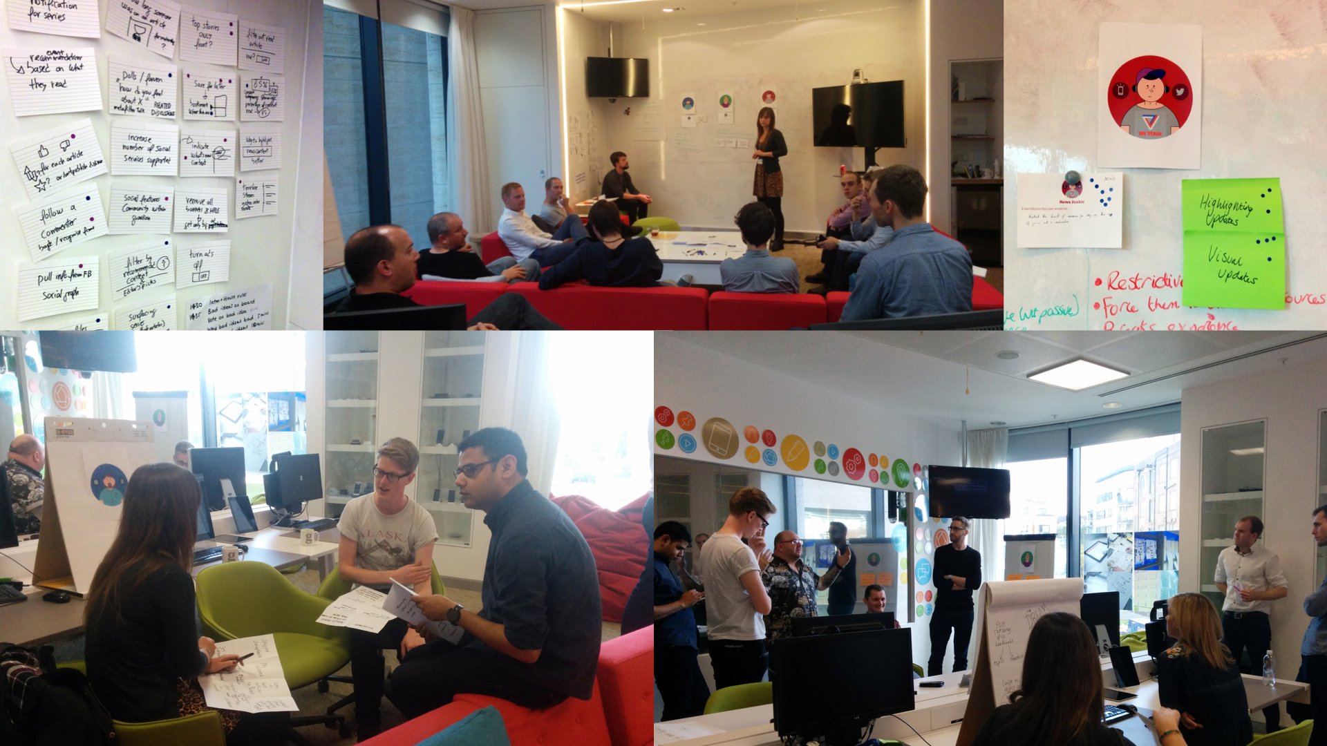
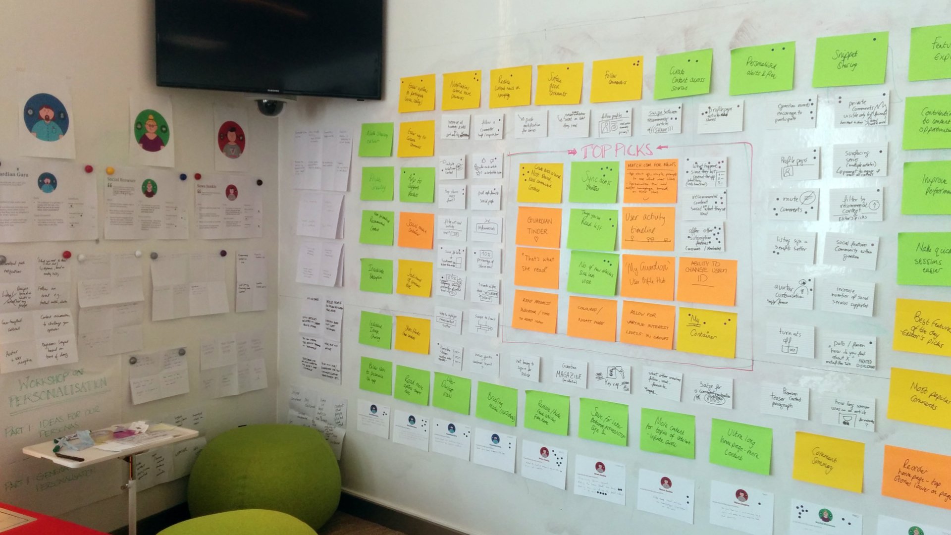
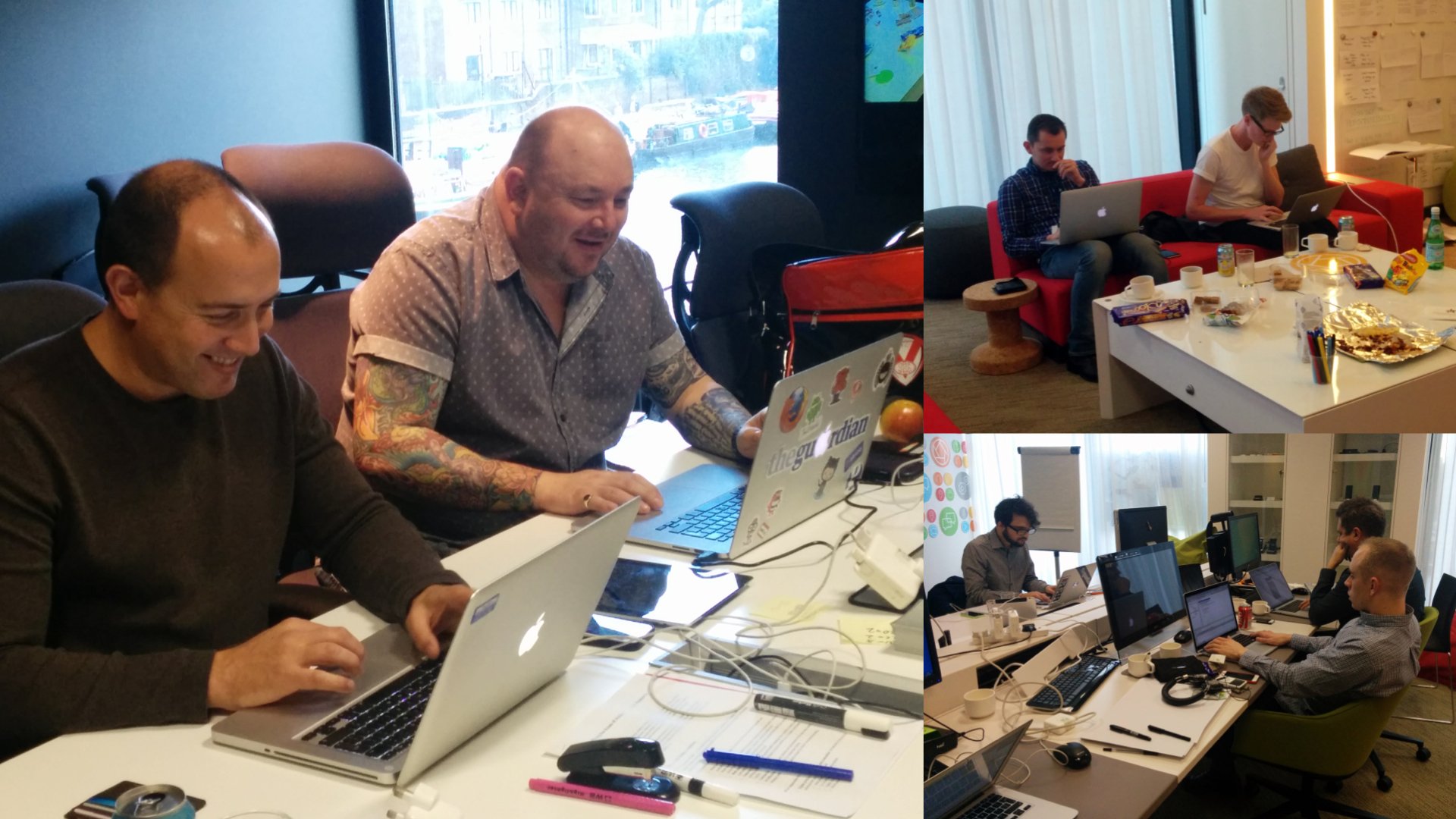
After about an hour spent turning the bad ideas into good ones we moved on to Crazy Eights - where the team individually comes up with eight ideas in four minutes. Everyone gets an A3 sheet of paper folded three times resulting in a grid of eight squares. The idea here is to push beyond the obvious. A lot of people probably have the same first idea, but it’s important not to get precious about individual solutions and focus on coming up with as many as possible. By the end of the day, we had over 100 ideas in total.
Next comes prioritising. Recently we have moved away from dot voting (where everyone in the room gets to vote on their favourite idea).
My current favourite method is to quickly measure ideas on an x-y axis, the x-axis goes from “hardest to implement” to “easiest to implement”, the y-axis goes from “least useful to the user” to “most useful to the user”. It’s not the sole deciding factor, but the ideas that land on the most valuable to user and easiest to build quadrant will give a clear steer. Another option is to list all the voted on ideas against the success metrics and measure them as a group to see which ideas score the highest. These methods force people to put aside personal favourites and instead think objectively about the best solutions.
As a tip for the number of people in the room, you should be able to feed the team in the brainstorm session with two pizzas. If your team is in double digits, consider dividing them up (ensuring a diversity of roles in each) and running two or more identical sessions.
Part III: Build
How can we quickly build the best ideas?
This tends to be the longest session and is all about prototyping and building the best ideas to show the team and users. If a creative sprint is about a general future direction this can be more of a hack day and if it is a focused, immediate issue it should be more of a build day where ideas are launch-ready at the end of the process.
For this sprint we had two days allocated to building prototypes, so we booked out the UX lab for everyone to work in. The key thing here was to get people away from their desks where they would inevitably end up getting back into daily habits.
Build days should end on a high; we invited the stakeholders back for the presentations and made sure there was a clear running order. Once presented, we voted on the best long term and short term ideas and also made sure it finished on a Friday so we could go out as a team afterwards.
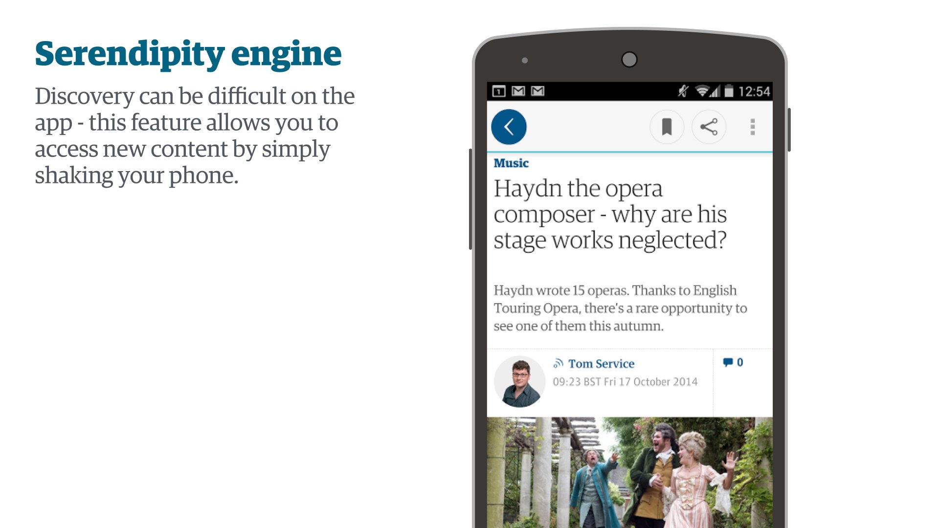
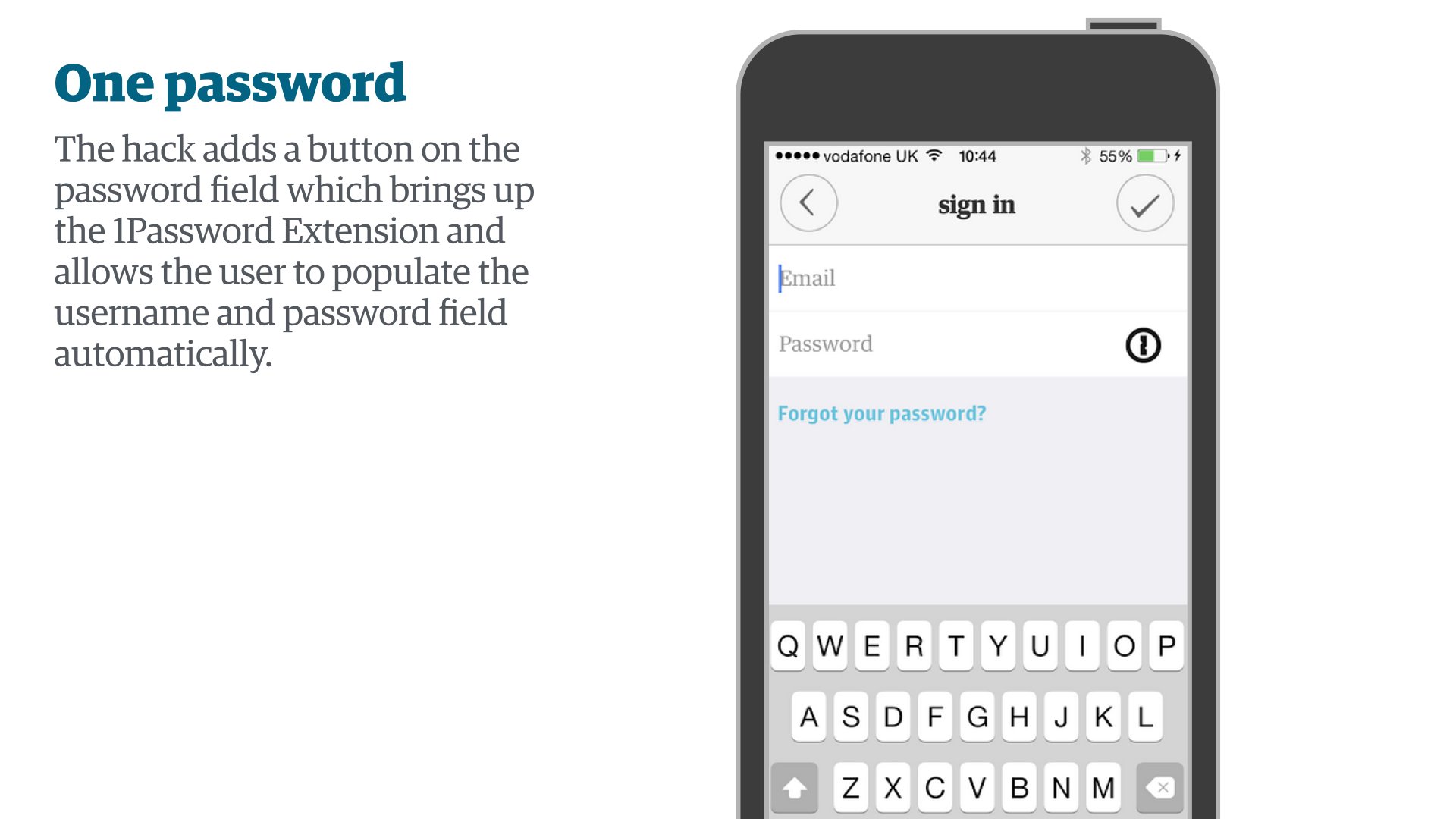
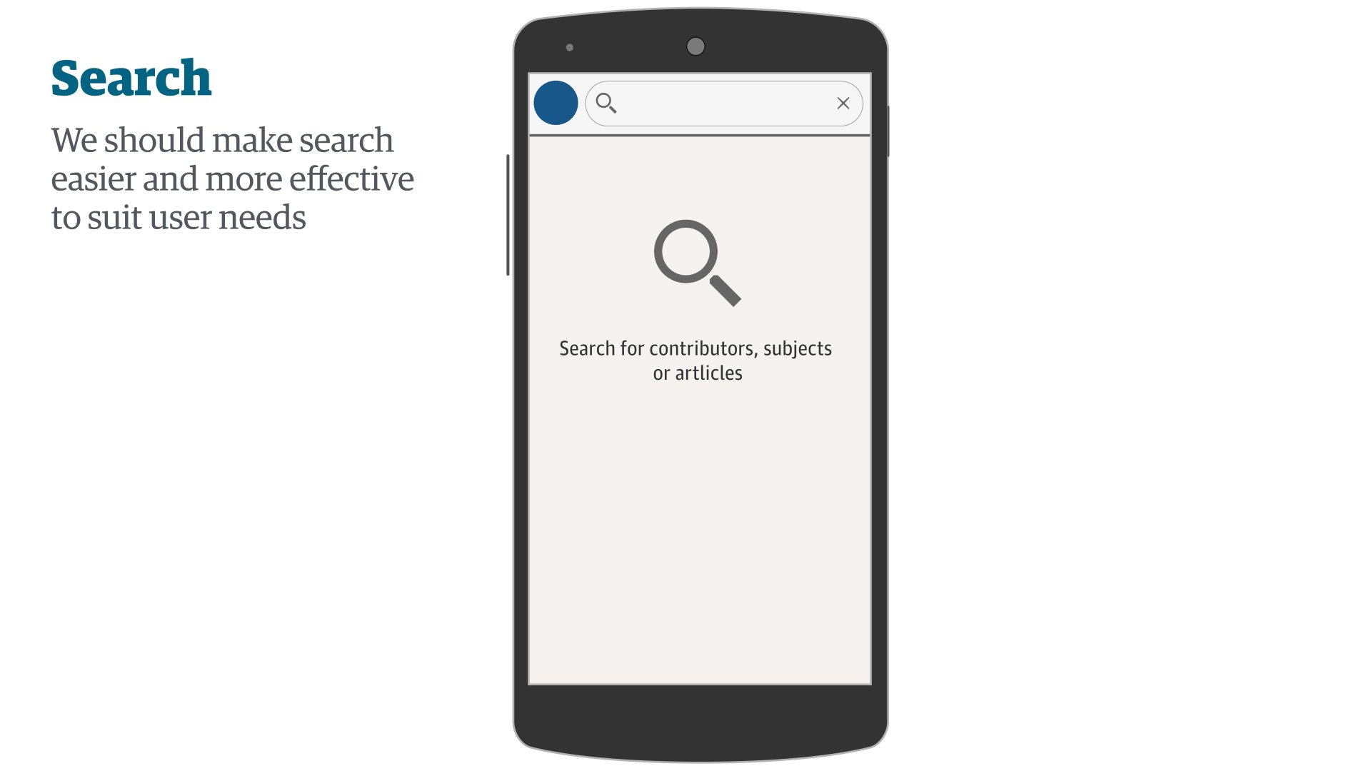
Here are a few of the short term ideas that came out of the four days:
Part IV: Test
How can we test our ideas with our users?
This is all about validating the new ideas with users. It can be done formally in a UX Lab, with guerilla testing (approaching strangers in the public) or with beta or A/B testing - depending on what is being tested.
To bring the sprint full circle, we had the same users from the diary study that informed the behaviour profiles back in the following week to have a look at our builds. We had three ideas that we tested out with them and as the whole team had worked on the ideas and builds, the whole team was invested in the outcome.
Next steps
Now what?
Based on the outcome this process can be repeated as many times as is needed. It is up to the product manager and project manager to prioritise the ideas and add them to the sprint cycle. The team should be kept up to date throughout.
From that sprint the improved search has gone live, the winner for the best long term idea tested extremely well and is still under production - so watch this space. From start to finish (excluding the research) the process took about a week and we had a huge amount to show for it.
The search designs went live a few weeks after the sprint.
Although my speciality is in crafting experiences for users, I’ve found crafting workshops and sprints to be a huge part of my role and a worthwhile one. The difference between learning and failure is time and money, and this fast process quickly justifies the ideas worth investing in.
UX permeates every part of the product and as a result is everyone’s responsibility. Creative sprints are a brilliant way to get a whole team thinking about great user experience and investing in making it happen, all in a matter of days.


